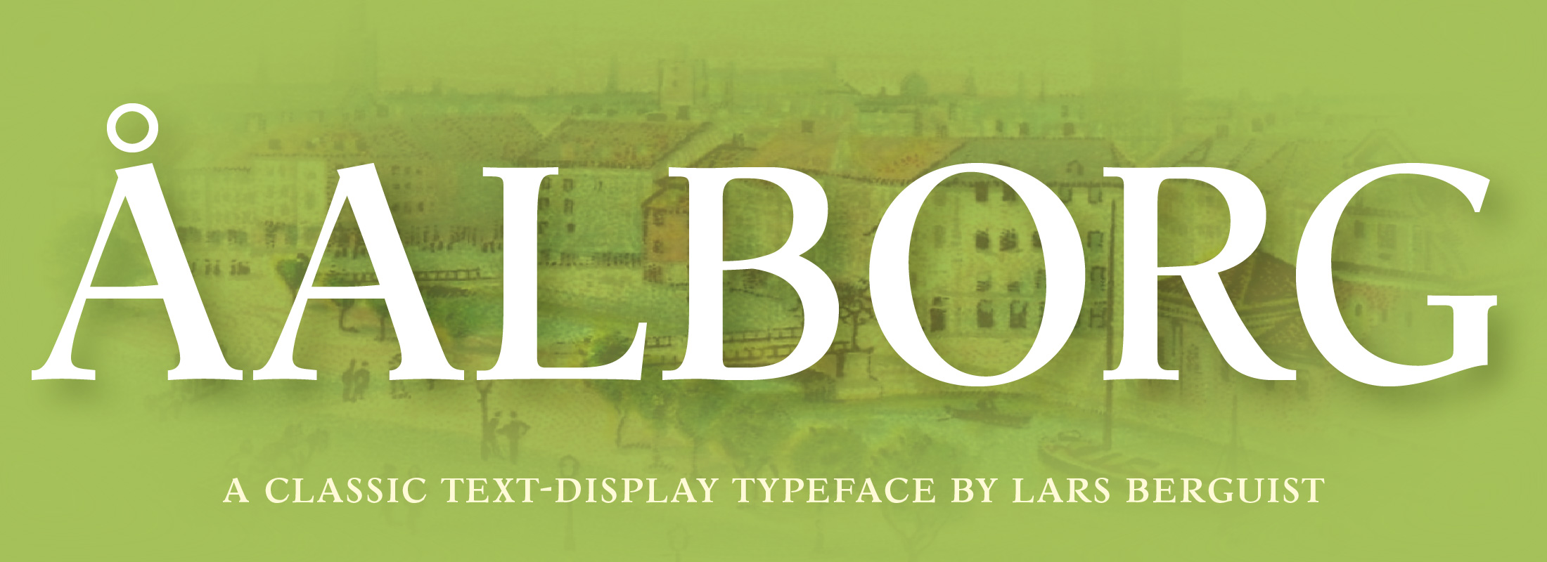
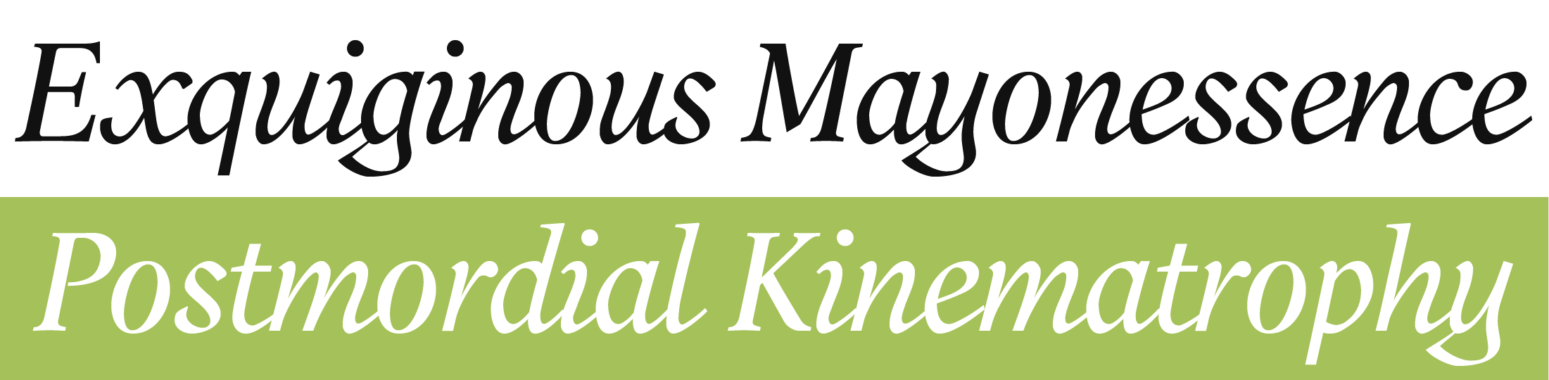
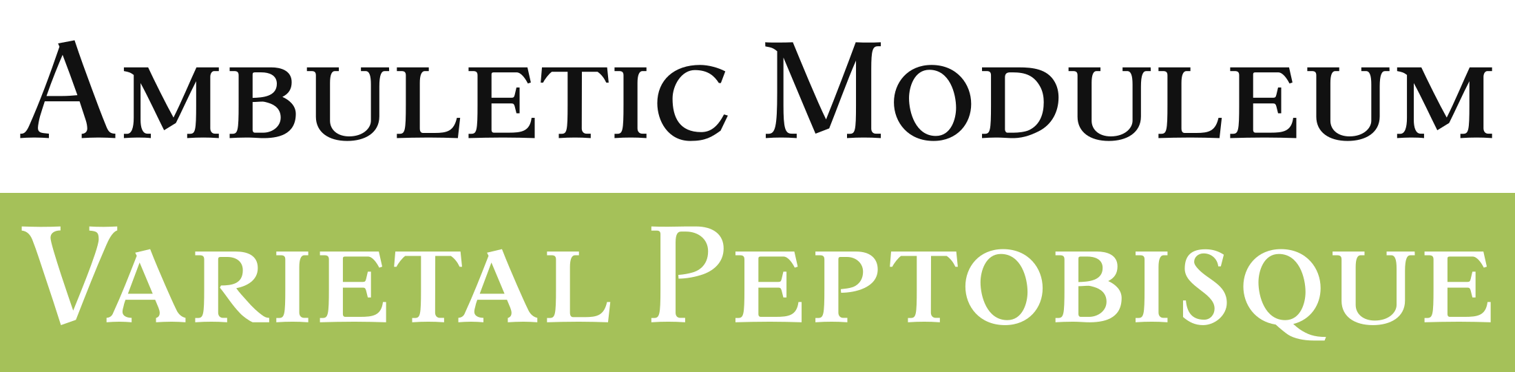
ÅALBORG by LARS BERGQUIST
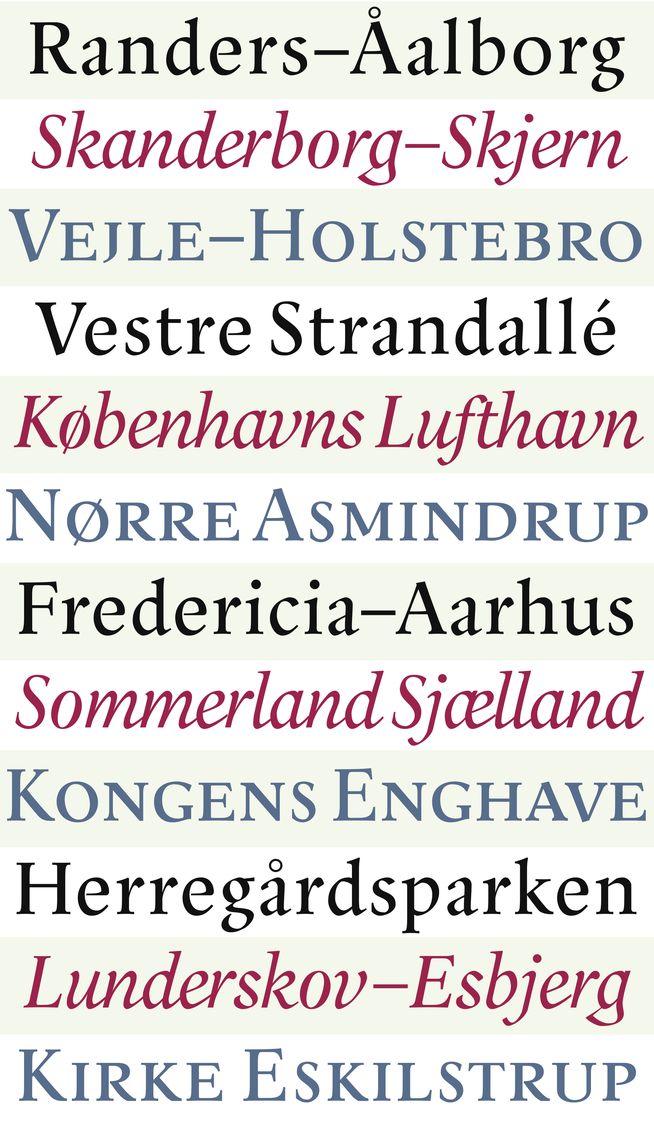
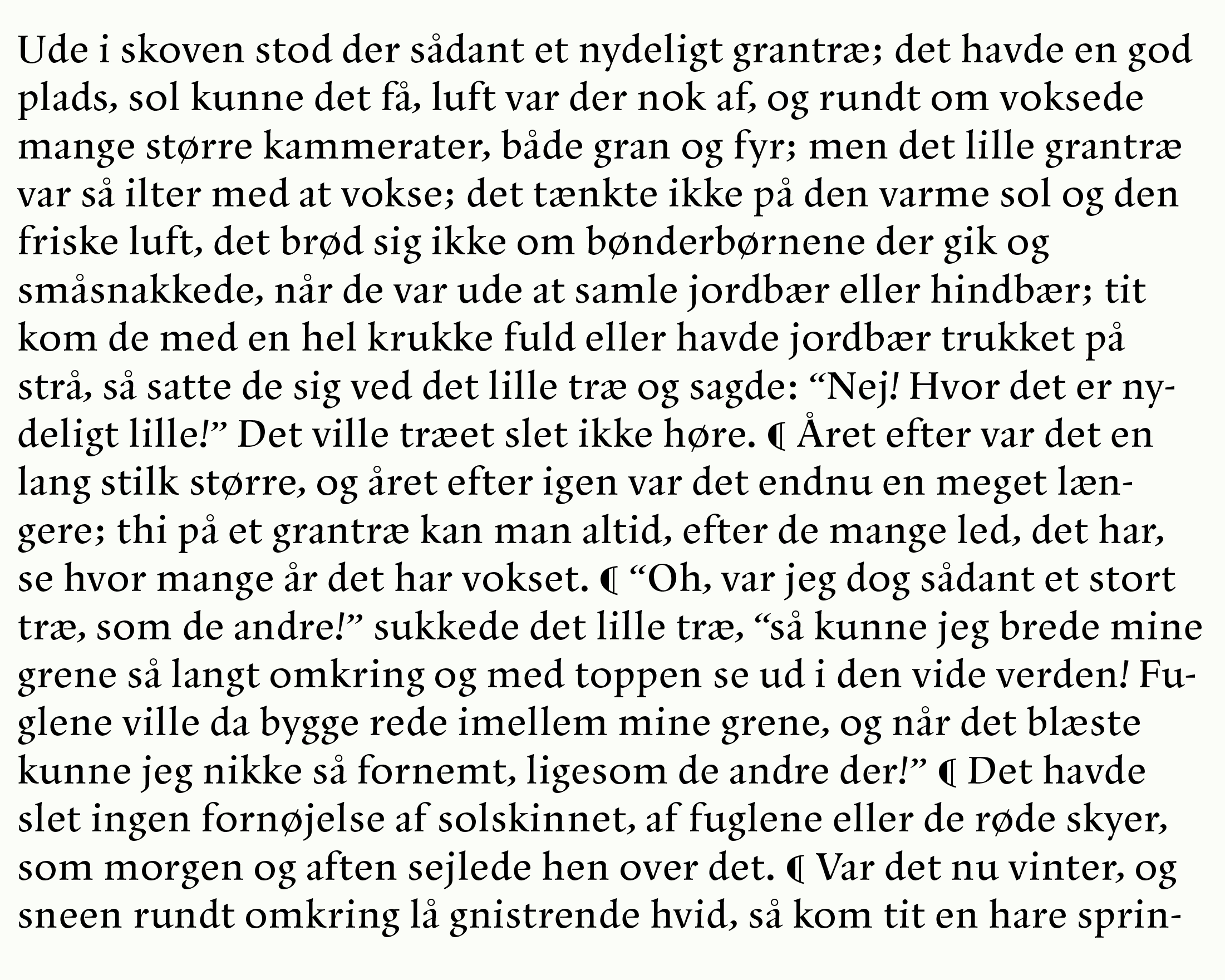
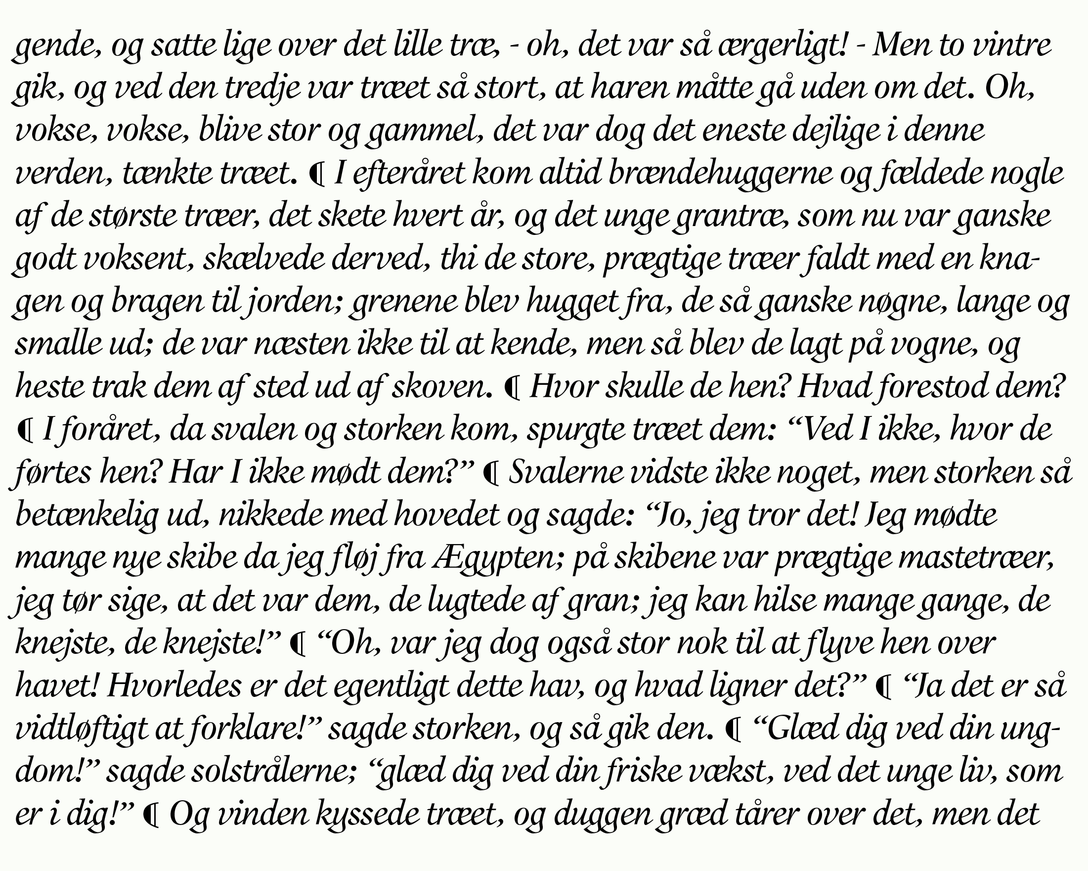
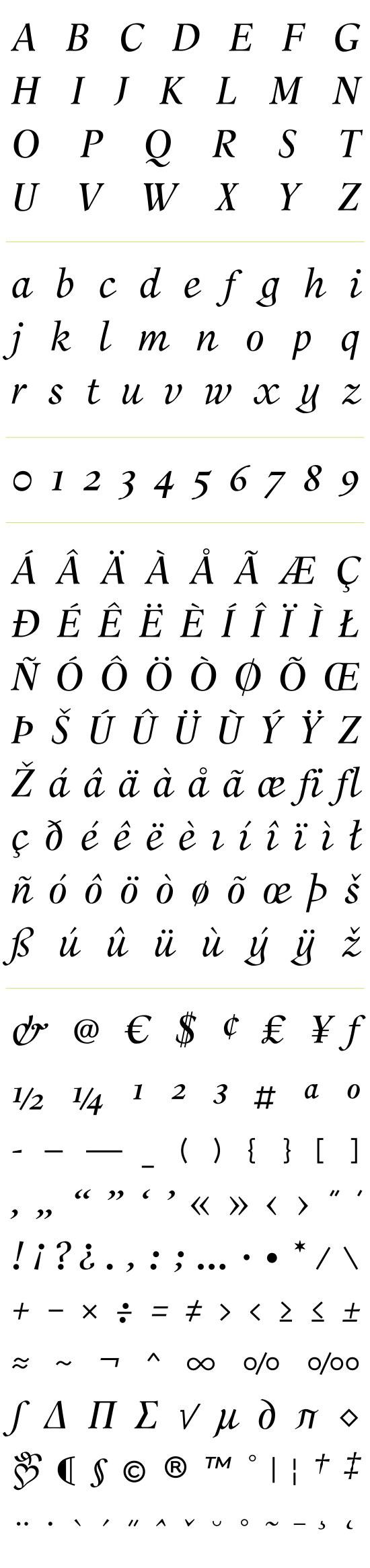
Åalborg is a three-font typeface (Roman, Italic and Smallcaps) intended for what may be termed text display — that is, extended text of less than War and Peace length, but with a higher profile than ordinary reading matter.
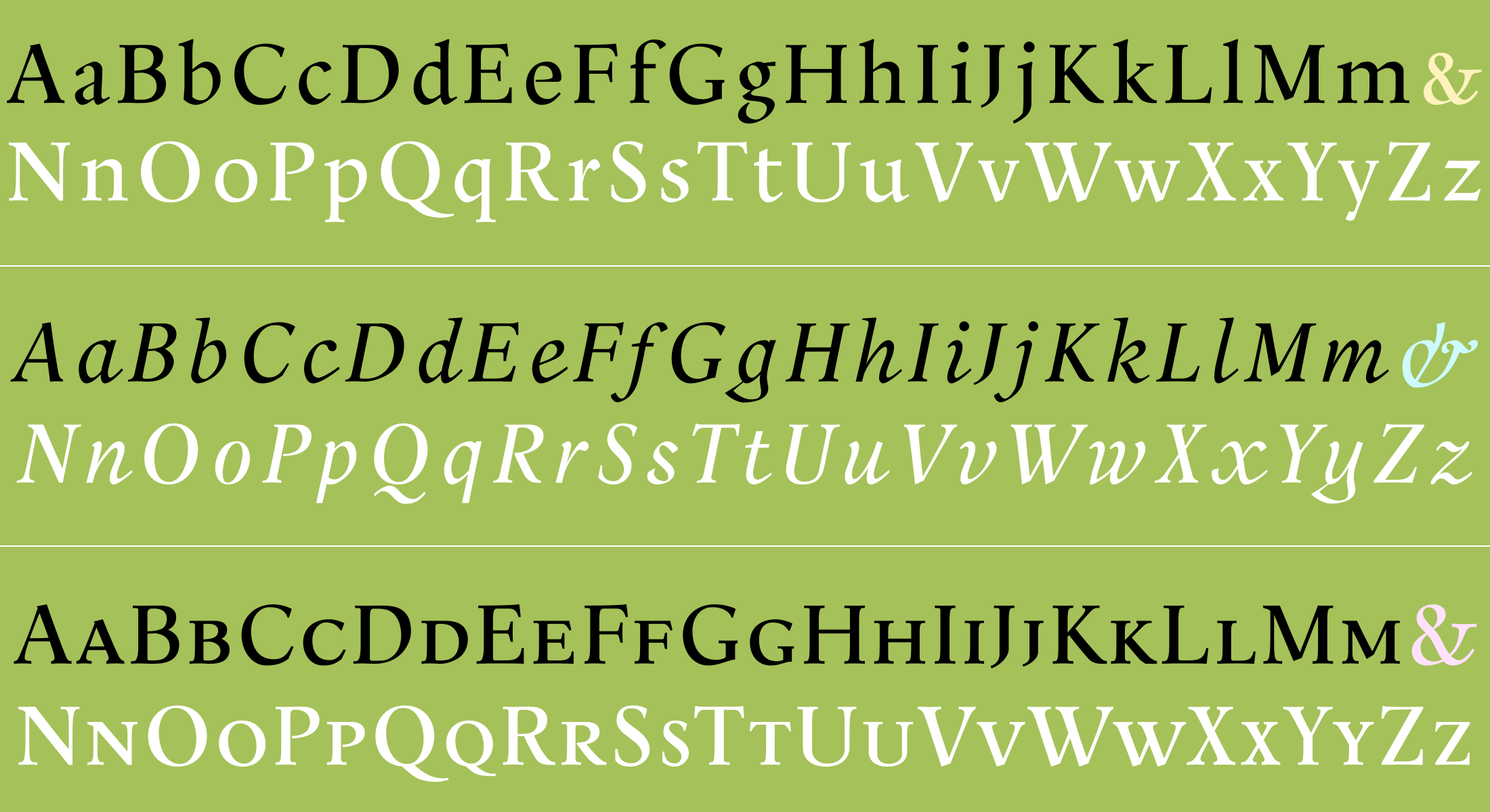
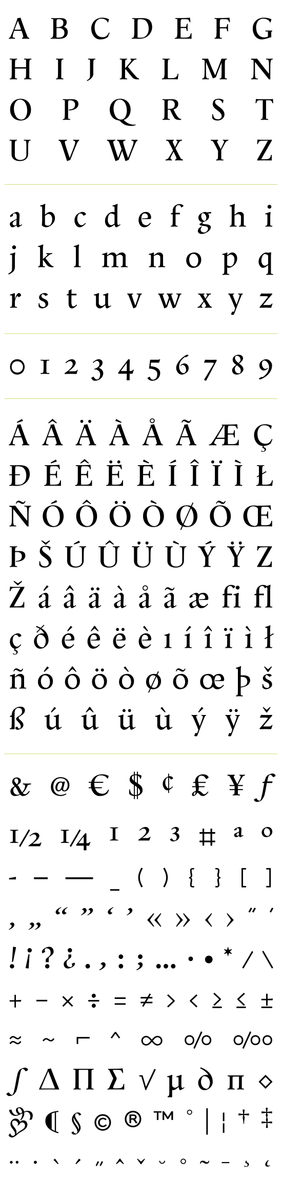
The lettershapes are firmly based on Renaissance models, but the detail work is about as calligraphic as type can be while still remaining useful for continuous reading. There is no Bold, as this would have compromised the design. The Roman and Italic have classic text figures, but the figures of the Smallcap font are ranging.
Åalborg was awarded a Certificate of Excellence in a large UNESCO-sponsored international type competition in 2001-02 in some very distinguished company, but under the name of Absolut Type. Though absolut is a regular word in any Swedish thesaurus, it was decided for reasons of legal safety to rename the face for a good, solid and absolutely non-copyrightable Danish city (which incidentally does produce a famous vodka…).
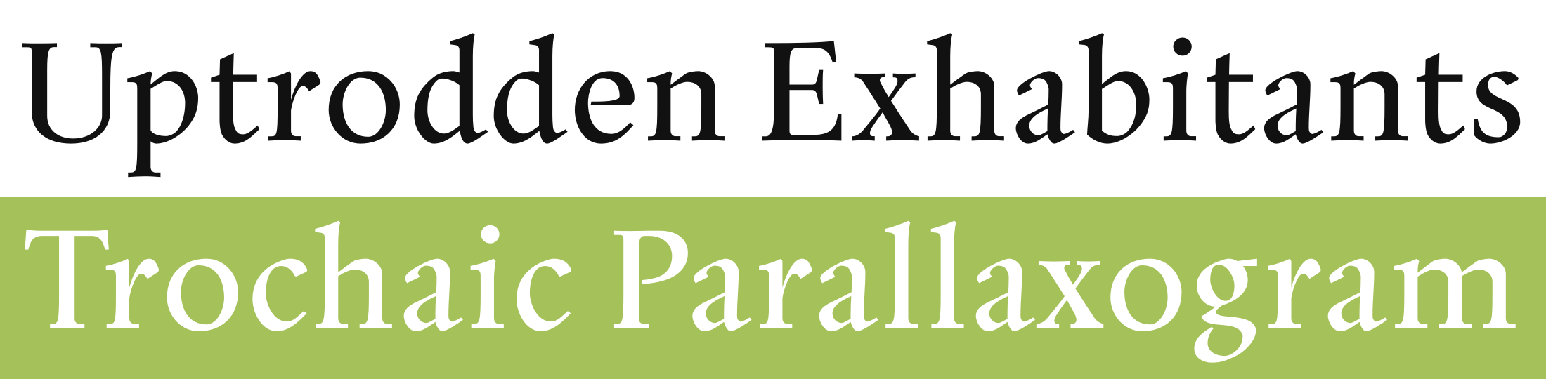
TYPE TESTER
ÅALBORG ROMAN
ÅALBORG ITALIC
ÅALBORG SMALLCAPS
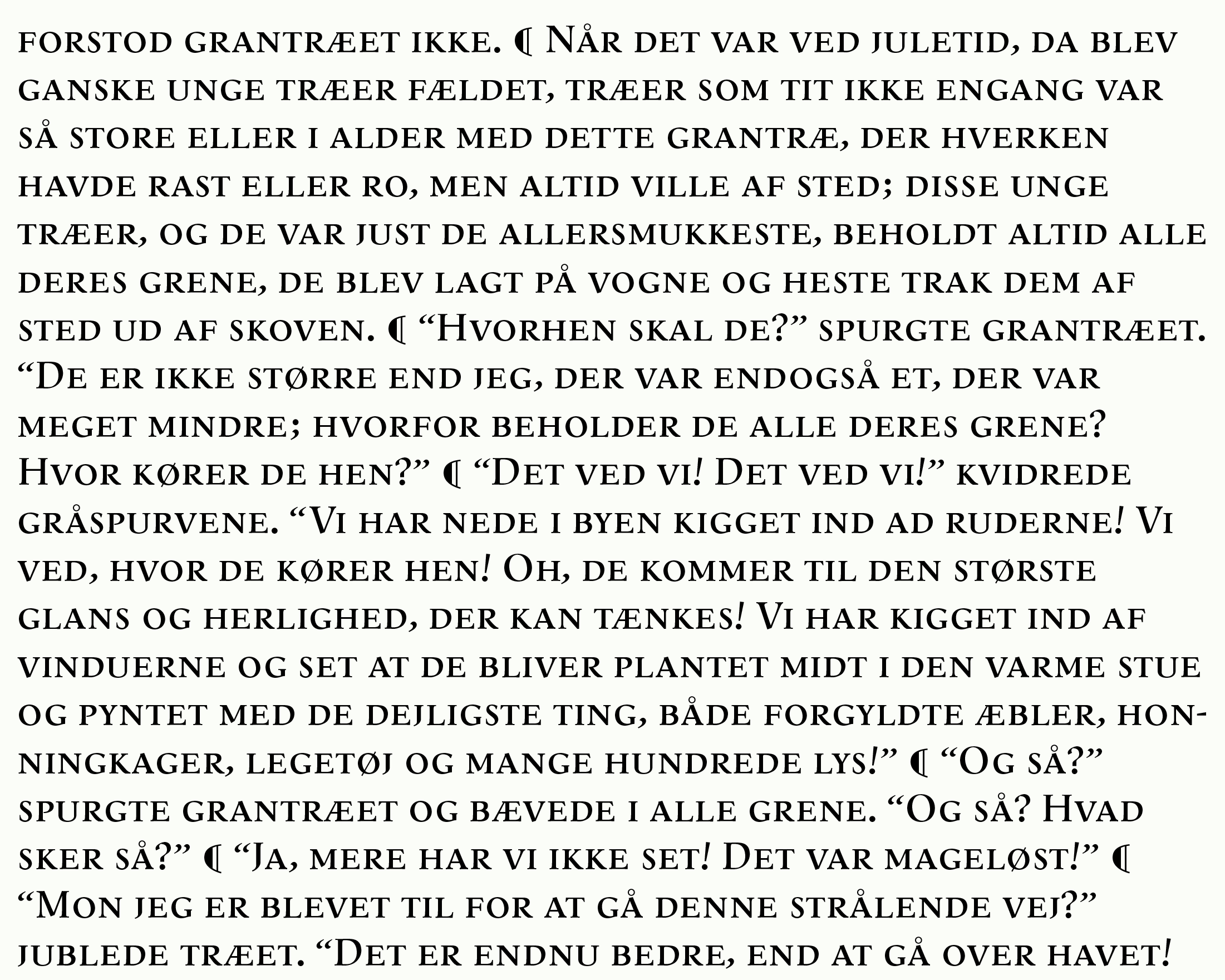
Excerpted from The Fir Tree by Hans Christian Andersen, 1844
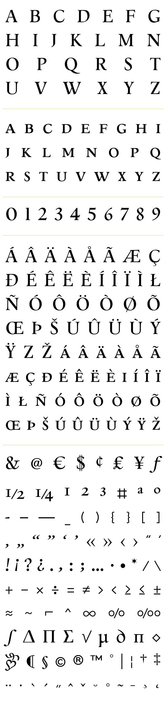
ÅALBORG CHARACTER SETS
ROMAN
ITALIC
SMALLCAPS