INEGALE BY MATTHIJS VAN LEEUWEN

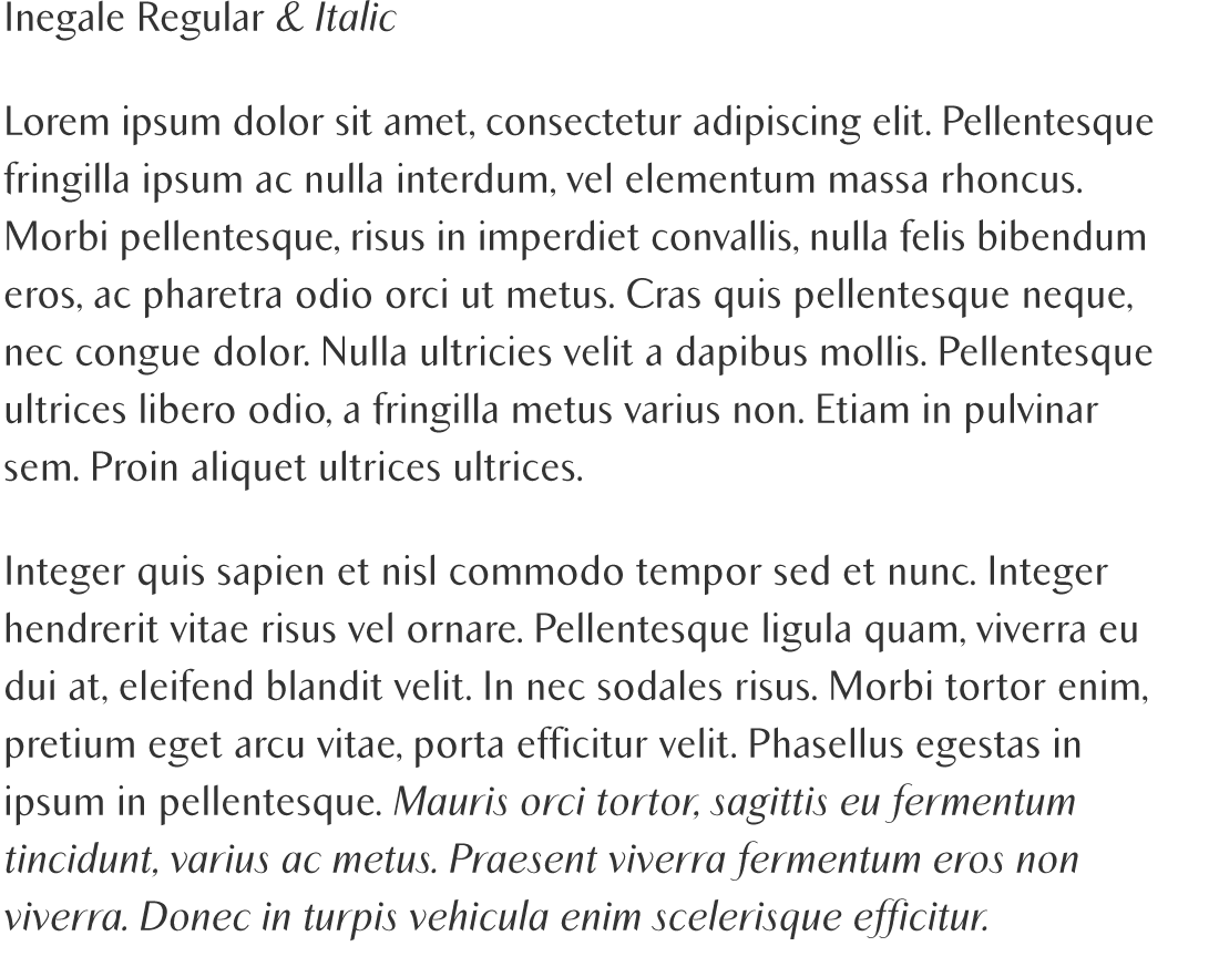
Inegale is a clean and calligraphic, yet legible, typeface designed by Matthijs Van Leeuwen for PSY/OPS Type Foundry in 1999.

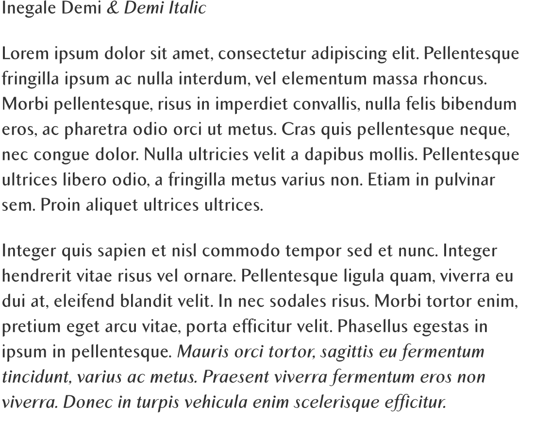
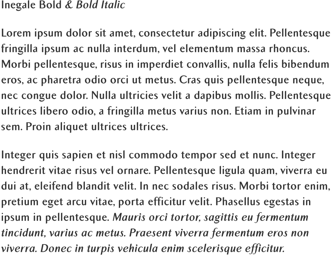
The Inegale Set contains six modern fonts in three weights: Regular, Demi and Bold. The Inegale fonts include Western and Eastern European characters, Stylistic Alternates, ligatures, and more.

Inégale

TYPE TESTER

The quick brown fox jumps over the lazy dog.
INEGALE CHARACTER SET

INEGALE REGULAR
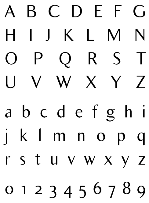
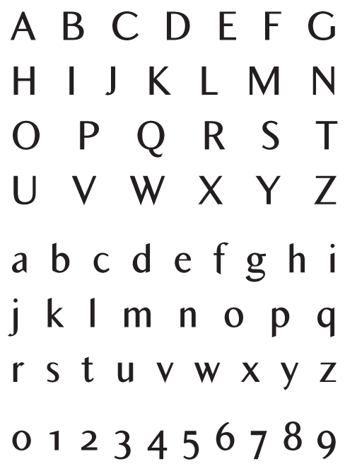
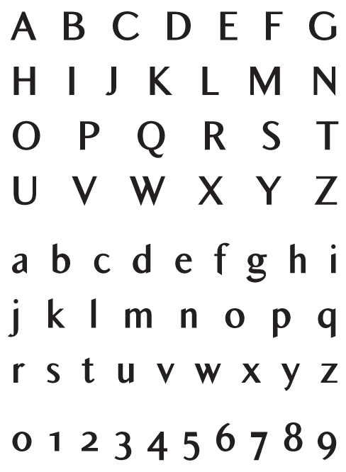
Inegale Regular - Uppercase, Lowercase and Numerals
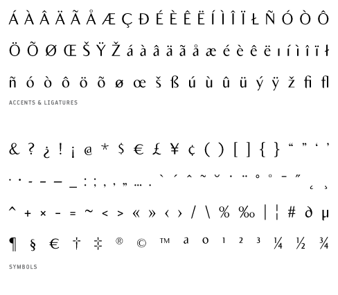
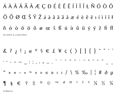
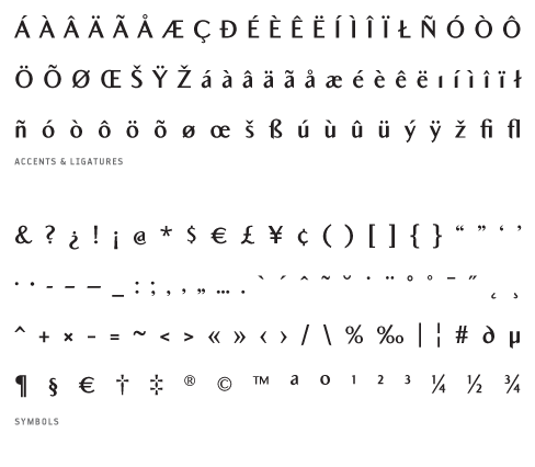
Inegale_Regular - Accents, Ligatures and Symbols
INEGALE ITALIC
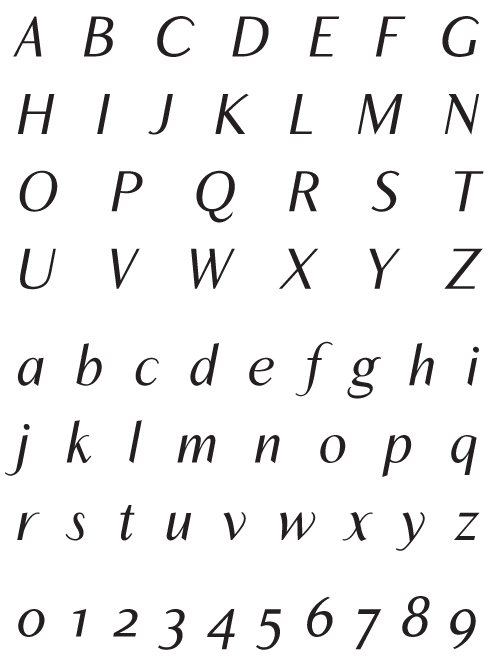
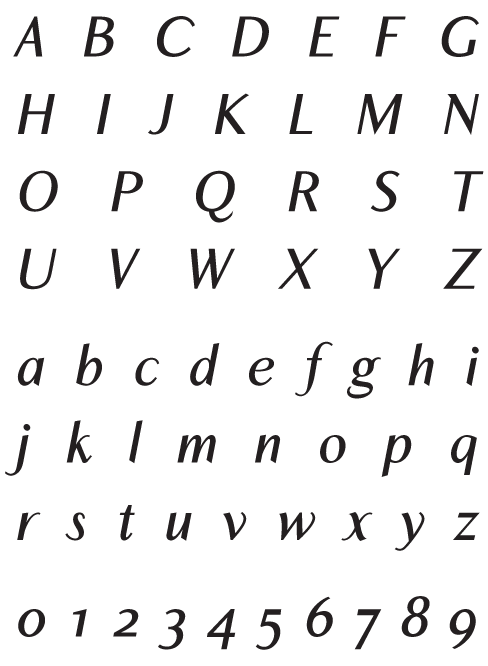
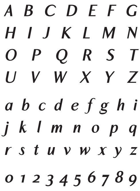
Inegale_Italic - Uppercase, Lowercase and Numerals
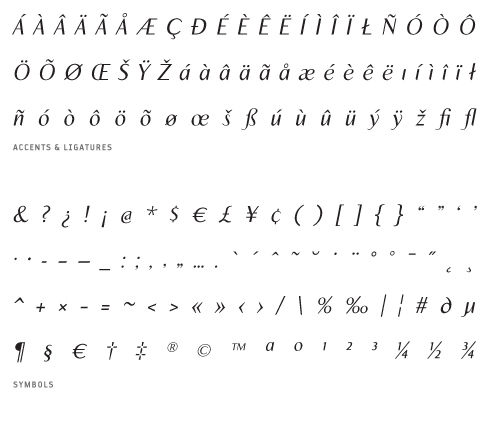
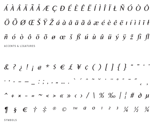
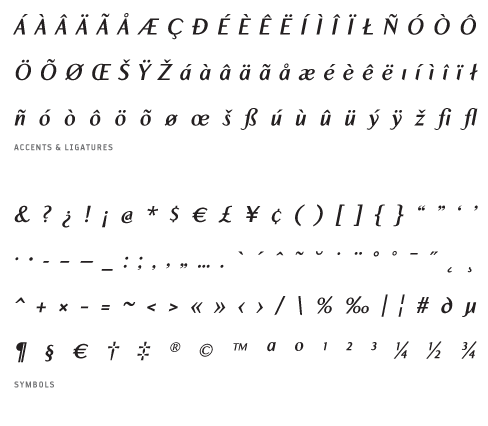
Inegale_Italic - Accents, Ligatures and Symbols
INEGALE DEMI
Inegale_Demi - Uppercase, Lowercase and Numerals
Inegale_Demi - Accents, Ligatures and Symbols
INEGALE DEMI ITALIC
Inegale_DemiItalic - Uppercase, Lowercase and Numerals
Inegale_DemiItalic - Accents, Ligatures and Symbols
INEGALE BOLD
Inegale_Bold - Uppercase, Lowercase and Numerals
Inegale_Bold - Accents, Ligatures and Symbols
INEGALE BOLD ITALIC
Inegale_BoldItalic - Uppercase, Lowercase and Numerals
Inegale_BoldItalic - Accents, Ligatures and Symbols

FONT LICENSING

Click on the font package you’re interested in →

Select your ideal licensing on the next screen

Continue shopping or check out from there