[twocol_one]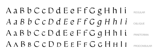 [/twocol_one]
[twocol_one_last]
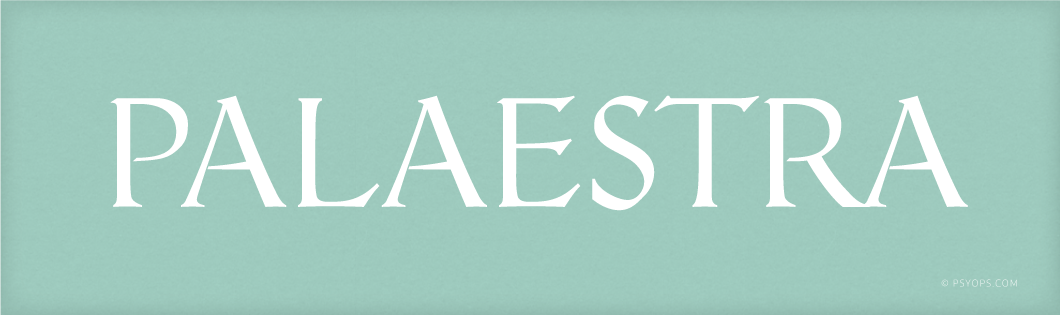
[typography font=”Cantarell” size=”18″ size_format=”px” color=”#d15326″]PALAESTRA BY LARS BERGQUIST[/typography]
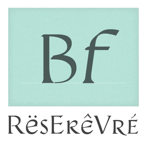
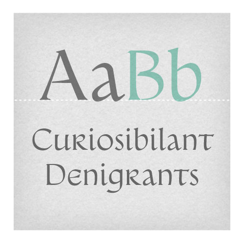
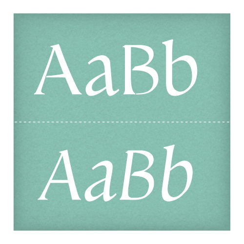
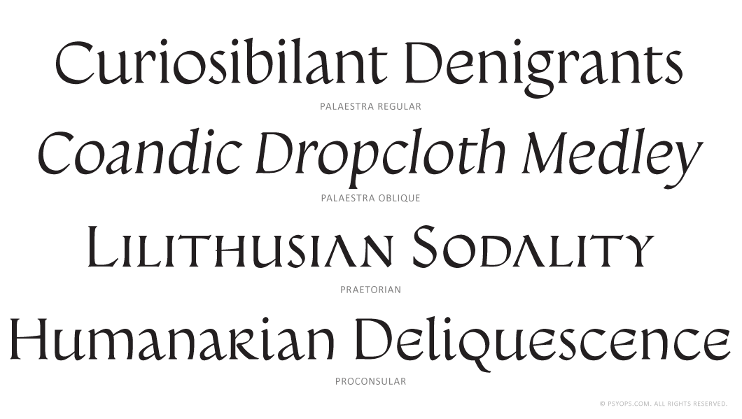
Praetorian, Proconsular and Palaestra are three faces inspired by informal, painted Roman wall writing (though not exactly graffiti) of the first centuries AD. This of course is where the Western alphabets really started. All faces share essentially the same caps, but the l/c characters have been progressively “modernized”: Praetorian is close to the originals, Proconsular veers toward the later uncial writing, while Palaestra has been “romanised” (with a lower-case ‘r’e.g.) and it has even been given an oblique version. Originally, Praetorian and Proconsular had no Arabic numerals, as these are of course a howling anachronism — they came into limited use some one thousand years later — but they have nevertheless been added. The caps are very useful by themselves, for initials and titling when a Roman touch is desired, though without the formality of the stone-cut capitalis quadrata (q.v. Triumphalis)
The Palaestra fonts include: Western and Eastern European characters, ligatures, and more. A Small Caps font is available (Proconsular).
Add to Cart → Palaestra Group. $75
Add to Cart → Palaestra Regular & Oblique. $49
Add to Cart → Palaestra Regular. $36
Add to Cart → Palaestra Oblique. $36
Add to Cart → Palaestra Group Proconsular. $36
Add to Cart → Palaestra Group Praetorian. $36
[/twocol_one_last]